Showing posts with label Artist Statement. Show all posts

Wednesday, February 10, 2016

Hugging a Porcupine


Systems and Models is a STEAM course, in which we analyze people, systems, groups, and organizations from the inside out, outside in, and their interactions. We studied the psychological architecture within groups and people through observations and data analysis. For our first action project, we were assigned to create a self-portrait and write an artist statement. The purpose of this action project was to combine all of the information we learned about ourselves through the various psychological assessment activities and create an artistic rendering of ourselves. Our artist statement will explain our self-rendering. I experienced an artistic block, and combated it by surrounding myself with inspiration. I am proud of my artistic rendering.

Title: Hugging a Porcupine
Medium: Paper, Pen, and Pencil
Size: “6.5” inches by “9.5” inches


GN, "The Porcupine" 2016

In our class, we took a series of psychological assessments. A psychological assessment refers to a process of testing to help arrive at some hypotheses about a person and their personality, behavior or capabilities. The Myers-Briggs 16 personalities test was a major influence because it reaffirmed my beliefs in how I perceive the world and make decisions. The Myers-Briggs Type Indicator (MBTI) is an introspective self-report questionnaire that has become the golden standard of psychological assessments and a multi million dollar business because of its concept that everyone can fit into one of 16 personality types.

The MBTI reports tells you your preference for each of four pairs: Judging or Perceiving, Thinking or Feeling, Sensing or Intuition, and Extraversion or Introversion, these four preferences together make up your type. My results concluded that I was an ENTP-A (extremely, extroverted, intuitive, prospective, and thinking) personality type. This means that I am knowledgeable, energetic, argumentative, and insensitive. I am the ultimate devil’s advocate. I thrive on the process of shredding arguments for the simple reason that it's fun. My personality type can be perceived as vexing and my quarrelsome fun oftentimes inadvertently burns bridges.

In addition to the MBTI, I took several psychological assessments which reaffirmed my beliefs that I am a very direct, assertive, logical, and analytical individual. Through the Enneagram, which assesses motivations, I learned that I was an Eight (The challenger). Eights enjoy taking on challenges that gives them opportunities to exceed themselves in some way. Some famous Eights are Martin Luther King, J.r, Lyndon Johnson, and Saddam Hussein. We are motivated to be self-reliant, to prove our strength and resist weakness, to be important in my world, and to be in control of situations.

I wanted my art piece to reflect all of the qualities I was assessed with having. I did not want a cliche self portrait. Keeping the results in mind, I decided to draw a picture of a porcupine. Porcupines are small rodents with an over-abundance of attitude. I am prickly like the porcupine. According to the DiSC, an assessment tool used to improve teamwork, I am directive, assertive, confrontation, and analytical. I pay attention to the meaning of pattern of information I receive, I look at logical explanation to almost anything, and I tend to devalue the "people" (emotional) parts of situation. Porcupines have a coat of quills used against predators. My quills are my words. In our defense, our spikes are preemptive attacks to protect our own feelings. Because of our fear of vulnerability we have developed this armor. We are resourceful and fearless in the face of danger. The traits listed above are oftentimes viewed negatively and I can personally regulate the degree in which they are expressed.

We reviewed a couple of experiments such as the Marshmallow Experiment and the Stanford Prison Experiment. Me being goal-oriented was very instrumental when partaking in our class mini version of the Stanford Marshmallow Experiment. The Stanford Marshmallow Experiment was a series of studies on delayed gratification. We were offered a choice between one small, immediately reward of 1 marshmallow or 2 marshmallows if we waited for a approximately 20 minutes. I love challenging myself and waited for approximately 30 minutes.

The Stanford Prison Experiment was most intriguing to me because it showed that under certain circumstances people can be "evil". The Stanford Prison Experience was a study of the psychological implications of becoming a prisoner or prison guard. Based on the attributes accorded to me by the various assessment, if I was in a position of power such as the one designed in the Stanford Prison Experiment I would abuse such power. I am not an evil person. My characteristics are double-edge swords. As an Eight, I have to capacity to persuade others to follow in all kinds of endeavors from making peace to wagging war.

The last test we took in class was the TKI, which assesses how you deal with conflict. When dealing with conflict, my strongest strategies were competition and compromisation. My lowest score was an avoider, which means I never shy away from conflict. My results were competer (9), compromiser (8), problem solver (7), Avoider (5), and accommodator (1). I agree with these results because I have employed these conflict resolution styles in the past.

In order to glean an understanding on the art of writing artist statement, I interviewed my friend Linda, a local artist whose work has been featured in local coffee shops around the city. "An artist statement allows the artist to communicate their thought process to an audience. It is important to remember though that it isn't a space to dictate or sway your audience's viewpoint or feelings on the pieces." I kept her advice in mind during my writing process and creation of the piece. I want my piece to be left to interpretation. Everyone has a different perception of me but these perception are woven with a single thread; the Porcupine.


Work Cited:


  • Lillian Cunningham. "Myers-Briggs: Does It Pay to Know Your Type?"Washington Post. The Washington Post, 14 Dec. 2012. Web. 08 Feb. 2016. <https://www.washingtonpost.com/national/on-leadership/myers-briggs-does-it-pay-to-know-your-type/2012/12/14/eaed51ae-3fcc-11e2-bca3-aadc9b7e29c5_story.html>.
  •  "The Myers & Briggs Foundation - My MBTI® Results." The Myers & Briggs Foundation - My MBTI® Results. N.p., n.d. Web. 08 Feb. 2016. <http://www.myersbriggs.org/my-mbti-personality-type/my-mbti-results/>.
  •  "Porcupines, Porcupine Pictures, Porcupine Facts - National Geographic."National Geographic. N.p., n.d. Web. 08 Feb. 2016. <http://animals.nationalgeographic.com/animals/mammals/porcupine/>.
  • "Home." Stanford Prison Experiment. N.p., n.d. Web. 12 Feb. 2016. <http://www.prisonexp.org/>.
  •  "CPP - The People Development People." Thomas-Kilmann Conflict Mode Instrument (TKI). N.p., n.d. Web. 12 Feb. 2016. <https://www.cpp.com/products/tki/index.aspx>.
  •  JACOBA URIST. "What the Marshmallow Test Really Teaches About Self-Control." The Atlantic. Atlantic Media Company, 24 Sept. 2014. Web. 12 Feb. 2016. <http://www.theatlantic.com/health/archive/2014/09/what-the-marshmallow-test-really-teaches-about-self-control/380673/>.

Friday, January 15, 2016

Face2Face


For our final Action Project in If These Walls Could talk course, we were assigned to carry out our mural from unit 2 into a large-scale mural. Using alternative materials and artistic technique chosen from our group, we proceeded to bring the mural to life by scaling up the image to fit the mural space, create a timeline and budget to successfully carry out the mural, and installed the mural. We also documented the process and edited the content into a 2-3 minutes video. We also wrote an artist statement explaining the intended purpose of the mural and the experience of creating the mural. I enjoyed working on the stencils and stamps.


Name: GN, DC, RD, MV, JV
Title: Face 2 Face
Date: 12/2015
Measurements:
Media & Techniques: Paper, ink, spray-paint, stencilling, wheat-pasting, wheat-paste, collage and block-printing.

For this action project, we installed the mural my group members and I proposed in Unit 2. In Unit 2, we experimented with different media and artistic techniques. We created a series of 5 swatches which allowed us to visualize our mural through a variety of media and artistic techniques. Our final mural is a tribute mural to GCE’s student body. The mural is a collage of faces made from GCE students’ facial features. Each facial feature highlights individuality and the collective faces represents us communally.

The techniques and materials our group previously chose to be most effective to carrying out the final mural were mosaic and wheat-pasting. We felt that the mosaic added texture and eccentricity, and wheat-pasting helped create a realistic collage image. After much deliberation, my team and I decided to proceed to bring the mural to life through stencilling, wheat-pasting, and block-printing.

Stenciling is an artistic technique which produces an image by applying pigment to a flat surface over an object with designs in it which creates the image. Stenciling allows the pigments to reach certain parts of the surface. A stencil is the resulting image and the object used. Stenciling is cost effective, it can be reused to rapidly reproduce the same design or image, it gives the piece a simplistic look, and allows the addition of details. This technique enhances our mural by making it simplistic and sleek. The mural consists of 5 walls. Three of those walls have white, red, black and gold spray-painted lotus flowers. We were inspired by Shepard Fairey’s signature lotus designs and artistic techniques. Frank Shepard Fairey is an American contemporary street artist, activist, and graphic designers. The other two walls have a checkered pattern of white and grey wallpaper block-print.
Block-printing is one of the oldest printmaking techniques. Block-printing is essentially using a carved material covered in ink to transfer an image on to a surface. It can be done with rubber, wood and linoleum. We chose to use linoleum. We printed out our wallpaper-looking design, traced it into the linoleum, then carved the design. We carved away the parts that we didn't want to print, as the ink will be applied to the raised surfaces to print the design.

We coated the walls silver grey. Our color scheme was grey, white, black, red, orange, and gold. We wanted neutral color with pops of color and coolness hence gold. After applying the wall background to our mural, we wheat-pasted our collaged faces. Wheat-pasting is a liquid adhesive made from flour and water. It is used for arts and crafts. Our mural transforms the space into an arena. It gives the space a sense of activity.

I enjoyed my experience working on the mural. I struggled with compromising with my team mates and being under time constraints. I was the documenter, artistic director, director of operation, and mule in addition to helping my team prep for the mural. I recorded every milestone achieved by my team and made sure that my group members had all the materials needed. I also took part in the decision making processes. My favorite role was documenting. I enjoyed recording our progress which allowed me to take pride in our hard work. I have a good camera which allowed me to take clear pictures. My least favorite role was being the artist director. I didn't feel comfortable making some of the executive decision I made. I unable to visualize concepts and as an artistic director you need such a skill. I wish we had more time to work on the mural. Due to last minutes changes the mural does not look as our group had envisioned, it is much more than we had envisioned. It's so RAW!

Monday, December 14, 2015

Swatch - Up


By the end of this term GCE (Global Citizenship Experience) will be relocating to a new community space that has just been built. For my If These Walls Could Talk course, we were assigned to create and finalized a mural in small groups that will be living in the new community space. We experimented with different mediums and artistic techniques. My peers and I created a series of 5 swatches, and individually reflected on our intentions and experience in choosing the material and or technique that we did. The purpose of this action project was to master the manipulation of different media and techniques and create material swatches for a mural, so that we know exactly what it would look like if it were carried out. In this unit, we examined the stories told through murals and how they were represented through the materials used to create them. We focused on murals from the 1920s (Los Tres Grandes), 1960s, and 1980s. The artistic techniques evolved overtime, from frescoes to stenciling and to xerox transfer. I enjoyed creating my stencil and I am looking forward to making our mural in the new community space.


Name: GN
Title: Global collaboration
Date/Year: 12/10/2015
Measurement: Swatch #1 - “4 inches” by “12 inches”.
Swatch #2 - “5.25 inches” by “12 inches”.
Technique/Medium: Stencil, spray paint (aerosol paint), canvas paper, cutting knife, glue, laser ink printed image, and a sharpie.

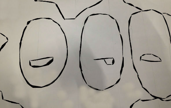
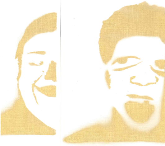
Our mural is a tribute mural to GCE’s(Global citizenship experience) student body. The mural is a collage of all of my group members’ facial features. Our collective facial features makeup 3 faces, a smiley, silly, and sad face. These faces represent the student body as a collective. Our mural celebrates the student body, but also calls attention to individuals within it. This concept coincides with that of my unit 1 action project. Each facial feature highlights individuality and the collective faces represents us (GCE student body) communally. The faces are encircled by Earth. The Earth represents students striving to become global citizens. The faces secures the space as ours.

We were inspired by two murals we saw, JR’s “Face2Face” project and the Cutup Collective projects. The Cutup collective is a group of artists, whose work mainly revolves around the manipulation of billboard advertisements. JR is a french artist who takes close up portraits of people who are misrepresented in the media. Our Field Experience to Pilsen also inspired us a lot. We were able to see how mosaics could add depth and texture to a piece. During our brainstorming process, we had a plethora of ideas. The reoccurring idea was collaging. Since we wanted to add a level of complexity, we settled on having the background be Earth.

DR. "Sketch" 2015 
Stenciling is an artistic technique which produces an image by applying pigment to a flat surface over an object with designs in it which creates the image. Stenciling allows the pigments to reach certain parts of the surface. A stencil is the resulting image and the object used. Stenciling dates back over 35,000 years ago, hand stencils were made by blowing pigment through bones over a hand held against a wall. Stenciling has many key advantages.

I chose stenciling because it is cost effective, it can be reused to rapidly reproduce the same design or image, it gives the piece a simplistic look, and allows the addition of details. This technique enhances the sketch by making it simplistic and sleek. Creating a stencil is a tedious process. We used Pixlr, a software program that adjusts the contrast and brightness of the final collaged images so that we had defined dark and light areas. We printed the image, pasted it onto a cardboard paper, and clearly outlined the areas of the image that will be cut out for the stencil. Then, I cut out the areas of the image where I wanted paint to appear, attached the stencil to canvas paper, applied the spray paint, and removed the stencil and inspected my work.

The final look had sleek lines and looked simplistic, which was what I intended. Unfortunately, we would not be using this technique in our final mural. Majority rules!


GN, "Stencil" 2015

Our final materials and techniques that our group chose to be the most effective to carrying out the final mural were mosaic and wheat-pasting. We felt that the mosaic added texture and eccentricity, and wheat-pasting helped create a realistic collage image.


JV. “Wheat Paste Swatch”. (2015)

The mosaic will consist of miscellaneous tiles and grout to fill in the spaces between the tiles. The mosaic adds depth and makes our piece pop out more. Mosaics are long-lasting and retains color. Wheat-pasting is simple paste mixture made of water and flour and creates a realistic image.


MV, “Happy Face Swatch”. (2015)


Thursday, November 19, 2015

Little Indi-Paki


For my If these walls could talk course, we were assigned to choose a neighborhood in Chicago, examined its history and the needs of its community, illustrate an image that forfilled those needs, and write an artist statement to defend our design. If these walls could talk is an art and history elective course that explores the history of murals. I chose the 50th ward, also known as West Ridge but focused on "Little India" for this project. The purpose of this action project was to illustrate an image that could be used to create a large-scale mural. I learned about the evolution of the techniques used to show perspective. I enjoyed learning about the Medici family and their influence in the Renaissance in Florence, Italy. I struggled with writing my artist statement, but meeting with my teacher helped clear the haze.

Below is my image and my artist statement!

GN, In Harmony 2015 


GN
11/2015
In Harmony 11” x 14”
Pencil on paper

For as long as I could remember I have been infatuated with India. My obsession is not just related to the Bollywood industry, the rich and spicy food, or the colorful ornate clothing. Although, I should mention that my closet is better suited to Punjab than Chicago and that I hanker over Barun Sobti rather than Zac Efron.

Little India is a ten-block stretch on Devon Avenue on Chicago’s north side. Little India is one of the most vibrant neighborhoods in Chicago. The culture, markets, and savor of this ten-block stretch on Devon Avenue help keep my addiction at arm’s length until I have an opportunity to disembark at Pathankot Airport. Being hit by a heady aroma of spices from a nearby restaurant or being drawn by a saris to a storefront are what keep attracting me to Little India. Skipping to Devon is a lot easier than trudging to Mumbai or Punjab. Devon is the most diverse street in the city. Although mainly Indian-focused, according to the Executive Director of West Ridge Chamber of Commerce, 75% of the area’s residential population is Jewish. Devon is home to Indian-Americans, Pakistani-Americans, Jews, Eastern-Europeans, and Assyrian-Americans and this melting pot gets along just great.

I’m proposing a mural that celebrates Little India, but also one that calls attention to the individual cultures within it. Although Little India is mainly focused on India, a lot of businesses are also owned by Pakistanis, Russians, Iraqis among others. My piece is both a tribute mural to make Little India even more beautiful and to bring to attention the plethora of cultures residing in Little India especially Pakistan that are often overlooked.

My sketch is of an Indian woman and a Pakistani man marrying. The motifs in the background are prominent symbols in both cultures. My sketch mimics the complex, more detailed style of Ancient Greeks and Ancient Egyptian paintings. This more complex and detailed style of paintings showcase the relations between Indian and Pakistani in there land of origin. Though Indians and Pakistanis don’t get along in their land of origin, I find it fascinating how they coexist in harmony in Little India. I was inspired by the use color and the simple yet intricate forms in the Ajanta cave Frescoes in India. I utilized the Hindi and Urdu both the official languages in each country to represent each culture’s individualism while also accentuating their cohesion and harmony. With the motifs receding in the background and telling its own story, I’ve utilized the use of vignettes to create meaning, fluidity, cohesion and uniformity in the painting. In order to represent the vibrancy of each culture, I used such colors as red, blue, yellow, pink, orange, and brown.

When installed, the mural will span the wall in the center of Little India and Pakistan. I hope that this mural transcends its audience to a state of joy, uniformity. and inclusion.


Monday, October 27, 2014

Tu Ne T'intéresses Pas Au Sexe?


For our last action project in Rhetoric, we were assigned to create an artistic representation of your feelings about an important social issue. The purpose of this action project was to produce a compelling work of art that transcends speech, one that “breaks the sound barrier”. My topic is adolescent sexuality, specifically teenage girls' sexuality. Ironically enough, I was afraid to choose this topic because of it's mature content and nature. I am proud of completing this project on time because I struggled with the timeline that was given.

GN (Print), 2014 
 I understand that it can be especially hard to talk about sex, but this can be very detrimental to teens. Yes, we have sex education classes at school, but as a teenager myself I don't feel like those classes answer all of our questions. Sex Ed focuses on the physical and the consequential aspects of sex, some teens including myself are interested in knowing about the emotional aspect of sex. What does it feel like? "Human sexuality is much more complex than the biological forces that initiate the sexual maturation process, " (The Development of Adolescent Sexuality). Adolescent sexuality does not only include physical development, but also emotional, social, moral, and cognitive development. Adolescent sexuality is usually associated with various risks, including unwanted pregnancies and sexually transmitted diseases, and this negative focus can be especially harmful because it can scare or prevent people from talking about it. No one said that having the "talk" is not awkward, but there is no reason to put off that discussion.

Related to this issue, I am also interested in how gender affects your view towards sex. Because of the way society frames female sexuality, girls generally think of virginity as sacred. "Researchers found that girls typically think of virginity as a gift, while boys think of virginity as a stigma (meaning they often seek to cover up the fact that they are virgins). In interviews, girls said that they viewed giving someone their virginity like giving them a very special gift" (Adolescent sexuality. (2014, October 21). In Wikipedia, The Free Encyclopedia).


AMK (Skirt), 2014
The purpose of my piece is to get people thinking and talking. I was inspired by Lisa Anne Auerbach, an artist based in Los Angeles who is interested in the way time changes the meaning of things and how fabric can outlast sentiments to create my artistic representation of adolescent sexuality. I didn't want a piece that was graphic. I wanted to make a loud political statement and encourage people to talk about sex, and so I decided to make my piece/artwork a wearable one.

GN (mannequin), 2014
I designed the pattern and created the print and skirt myself. With the help of a family friend I was able to print my pattern on the fabric. Squares are a major part of my print. They represent grounding because of their fixed lines. They also represent foundations (homes) because that is where, in my opinion, teens should be getting a foundation about sex.

My print/pattern has a very African vibe to it because I am African. Red represents sexuality which correlates with my topic, adolescent sexuality. Blue is considered beneficial to the mind and body, and learning about sexuality benefits you both mentally and physically. Many of us think of the color green as the color of nature, but green also has strong emotional correspondence with safety, which communicates a message of safe sex to the viewer. Skirts are considered very feminine, and in the 1910-1912, women were only allowed to wear ankle-length skirt with no slit. I wanted my piece I utilized repetition because I am using the same color pallet over and over again. I also employ description because my print is vibrant and utilizes the sense of sight to capture people's attention. I would love for everyone to be wearing my art piece, instead of it being confined in a museum.

Statistics:

  • A new study from Harvard finds that more than 40 percent of parents don't get around to talking to their kids about safe sex practices until after their kids are sexually active.
  • Each year, U.S. teens experience as many as 850,000 pregnancies, and youth under age 25 experience about 9.1 million sexually transmitted infections (STIs).
  • A study on examining sexual messages in popular TV shows found that 2 out of 3 programs contained sexually related actions. 1 out of 15 shows included scenes of sexual intercourse itself.

Materials for skirt:

- Fabric: Cotton

- Needles

- Sewing machine

- Thread

- Buttons

- Scissors

- Color pencils

- Ruler

- Measuring Tape

- Fabric Printer

- HP Intel, a 3rd generation Intel core i5 processor
Works Cited:
  1. Adolescent sexuality. (2014, October 21). In Wikipedia, The Free Encyclopedia. Retrieved 15:16, October 22, 2014.
  2. Unit, Courtney Hutchisonabc News Medical. "Don't Let the 'Sex Talk' Come Too Little, Too Late for Your Teen." ABC News. ABC News Network, 07 Dec. 2009. Web. 27 Oct. 2014. 
  3. Angela Oswalt, MSW, Edited by C. E. Zupanick, Psy.D. "The Development of Adolescent Sexuality - Child Development Theory: Adolescence." The Development of Adolescent Sexuality - Child Development Theory: Adolescence. Sevencountries, n.d. Web. 27 Oct. 2014.
  4. McKeon, Brigid. "Effective Sex Education." Effective Sex Education. Advocates for Youth, 2016. Web. 24 Oct. 2014.