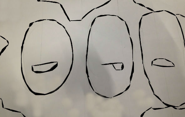
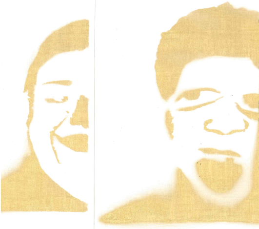
For our final Action Project in If These Walls Could talk course, we were assigned to carry out our mural from unit 2 into a large-scale mural. Using alternative materials and artistic technique chosen from our group, we proceeded to bring the mural to life by scaling up the image to fit the mural space, create a timeline and budget to successfully carry out the mural, and installed the mural. We also documented the process and edited the content into a 2-3 minutes video. We also wrote an artist statement explaining the intended purpose of the mural and the experience of creating the mural. I enjoyed working on the stencils and stamps.
Name: GN, DC, RD, MV, JV
Title: Face 2 Face
Date: 12/2015
Measurements:
Media & Techniques: Paper, ink, spray-paint, stencilling, wheat-pasting, wheat-paste, collage and block-printing.
For this action project, we installed the mural my group members and I proposed in Unit 2. In Unit 2, we experimented with different media and artistic techniques. We created a series of 5 swatches which allowed us to visualize our mural through a variety of media and artistic techniques. Our final mural is a tribute mural to GCE’s student body. The mural is a collage of faces made from GCE students’ facial features. Each facial feature highlights individuality and the collective faces represents us communally.
The techniques and materials our group previously chose to be most effective to carrying out the final mural were mosaic and wheat-pasting. We felt that the mosaic added texture and eccentricity, and wheat-pasting helped create a realistic collage image. After much deliberation, my team and I decided to proceed to bring the mural to life through stencilling, wheat-pasting, and block-printing.
Stenciling is an artistic technique which produces an image by applying pigment to a flat surface over an object with designs in it which creates the image. Stenciling allows the pigments to reach certain parts of the surface. A stencil is the resulting image and the object used. Stenciling is cost effective, it can be reused to rapidly reproduce the same design or image, it gives the piece a simplistic look, and allows the addition of details. This technique enhances our mural by making it simplistic and sleek. The mural consists of 5 walls. Three of those walls have white, red, black and gold spray-painted lotus flowers. We were inspired by Shepard Fairey’s signature lotus designs and artistic techniques. Frank Shepard Fairey is an American contemporary street artist, activist, and graphic designers. The other two walls have a checkered pattern of white and grey wallpaper block-print.
Stenciling is an artistic technique which produces an image by applying pigment to a flat surface over an object with designs in it which creates the image. Stenciling allows the pigments to reach certain parts of the surface. A stencil is the resulting image and the object used. Stenciling is cost effective, it can be reused to rapidly reproduce the same design or image, it gives the piece a simplistic look, and allows the addition of details. This technique enhances our mural by making it simplistic and sleek. The mural consists of 5 walls. Three of those walls have white, red, black and gold spray-painted lotus flowers. We were inspired by Shepard Fairey’s signature lotus designs and artistic techniques. Frank Shepard Fairey is an American contemporary street artist, activist, and graphic designers. The other two walls have a checkered pattern of white and grey wallpaper block-print.
Block-printing is one of the oldest printmaking techniques. Block-printing is essentially using a carved material covered in ink to transfer an image on to a surface. It can be done with rubber, wood and linoleum. We chose to use linoleum. We printed out our wallpaper-looking design, traced it into the linoleum, then carved the design. We carved away the parts that we didn't want to print, as the ink will be applied to the raised surfaces to print the design.
We coated the walls silver grey. Our color scheme was grey, white, black, red, orange, and gold. We wanted neutral color with pops of color and coolness hence gold. After applying the wall background to our mural, we wheat-pasted our collaged faces. Wheat-pasting is a liquid adhesive made from flour and water. It is used for arts and crafts. Our mural transforms the space into an arena. It gives the space a sense of activity.
I enjoyed my experience working on the mural. I struggled with compromising with my team mates and being under time constraints. I was the documenter, artistic director, director of operation, and mule in addition to helping my team prep for the mural. I recorded every milestone achieved by my team and made sure that my group members had all the materials needed. I also took part in the decision making processes. My favorite role was documenting. I enjoyed recording our progress which allowed me to take pride in our hard work. I have a good camera which allowed me to take clear pictures. My least favorite role was being the artist director. I didn't feel comfortable making some of the executive decision I made. I unable to visualize concepts and as an artistic director you need such a skill. I wish we had more time to work on the mural. Due to last minutes changes the mural does not look as our group had envisioned, it is much more than we had envisioned. It's so RAW!
We coated the walls silver grey. Our color scheme was grey, white, black, red, orange, and gold. We wanted neutral color with pops of color and coolness hence gold. After applying the wall background to our mural, we wheat-pasted our collaged faces. Wheat-pasting is a liquid adhesive made from flour and water. It is used for arts and crafts. Our mural transforms the space into an arena. It gives the space a sense of activity.
I enjoyed my experience working on the mural. I struggled with compromising with my team mates and being under time constraints. I was the documenter, artistic director, director of operation, and mule in addition to helping my team prep for the mural. I recorded every milestone achieved by my team and made sure that my group members had all the materials needed. I also took part in the decision making processes. My favorite role was documenting. I enjoyed recording our progress which allowed me to take pride in our hard work. I have a good camera which allowed me to take clear pictures. My least favorite role was being the artist director. I didn't feel comfortable making some of the executive decision I made. I unable to visualize concepts and as an artistic director you need such a skill. I wish we had more time to work on the mural. Due to last minutes changes the mural does not look as our group had envisioned, it is much more than we had envisioned. It's so RAW!