Showing posts with label Elective 2015. Show all posts

Friday, January 15, 2016

Capsule - Book Bound


Our action project for Book Bound was a digital portfolio that offers an overview of our learning and experience of the course. Book Bound is an humanities course, in which we explored the definition of reading, evaluated its importance, explored works that are considered "classics" and understand the criteria necessary to earn such stature. We read The Great Gatsby by F.Scott Fitzgerald as an example of a "classic". I was indifferent about The Great Gatsby. I thought the plot was a bit diluted, but very thought provoking. We investigated the literary canon, critique it, offer alternatives and additions. The literary canon is the Great book list. The idea of a literary canon implies "official status" and to be entered into the canon mean gain to certain privileges. Also, we research roles necessary to build a library. We visited two libraries (a public library and school library) to familiarize ourselves with the inner-workings of a library, to find inspiration and guidance for our vision of our school library. I envision our school library with tons of work space, infinite availability of books, recording booths, computers, art/cool posters plastered on the walls and comfortable chairs. I enjoyed our field experiences because I learned about the different search engines for academic research offered at the library. For this action project, we were assigned to put together a portfolio of our best work throughout the course. My favorite project was our choice for the canon slideshow.


Storyboard:

Before embarking on our Book Bound adventure of the importance and history of reading, we took some time to remember and contemplate who we are as readers. Through the use of StoryboardThat, an autobiographical web-tool we were able to tell the story of our lifespan as readers, specifically on learning to read. Our stories had to include at least 5 frames and captions. We considered plot point such as: when and where we were when we first began to read, who helped us learn to read, what struggles we faced as readers, and how we felt reading in school as we crafted our stories. Prior to completing this activity I talk to my mom who has been very instrumental in my development as a reader for specific details about my reading history. Moms played a huge role in my classmates' reading stories as well. This assignment allowed many of us to dive into ourselves and create connections between our reading patterns and our history with reading. I had lots of fun working on this assignment. I struggled with how to start, but my conversation with my mom helped clear the haze. I added more details to my story and proofread. I am proud that my reading story shows my progression.


Slideshow:

What is a classic? How does something acquire such status? What does such a title suggest about the thing itself? These were some the questions we were presented with in the beginning of the course. Classic "belonging to the standard authors of Greek and Roman antiquity" "of the highest class; approved as a model" from the french word classique (17c.) from Latin classicus is a term used to categories books of the highest caliber. Certain books receive this status and end up on required reading lists across the U.S. These grouped together, literary classics are referred to as "the canon". The literary canon is the great book lists. They are texts that have been deemed worthy to be read by anyone who considers themselves cultured. For this assignment, we chose a book we believed belong in the canon and created a slideshow justify our choice. Also, we presented and defended our book selection to our peers. I wanted to share my enthusiasm for the Percy Jackson series by Rick Riordan with everyone hence why I chose to publish this assignment. I struggled with finding images of scenes for theme illustration. I added more details to the lesson plan portion of the presentation, added an image, and proofread.


Literary Journal:

We were assigned to create our own literary magazine/journal in team of 4s. Literary magazine is a periodical magazine/journal dedicated to literature. Literary magazines publish short stories, poetry, literary criticism, letters, interviews, essays, and many more. Our literary magazine consisted of external submission, pieces from all group members, and images. This assignment showcased different types of literature. I really proud of the pieces in the magazine. We split up different tasks among ourselves. Miscommunication impacted our quite a bit, but in the end we pulled through. I fixed the page set-up.


Literature Poster:

We created propaganda literary posters based upon a guiding question about literacy. We research the answer to our guiding question using reliable sources. My guiding question was "How many books does the average american read yearly?" The average American read 12 books in the past 12 months according to the Pew research center. The purpose of this poster and course is to promote literacy. I want to encourage literacy in the most effective way as possible and this assignment allows me to do so. I was difficult to come up with a concept for my drawing. I used paper and pencil. I am proud to have persevered.

GN, Literature poster 2015. 


Face2Face


For our final Action Project in If These Walls Could talk course, we were assigned to carry out our mural from unit 2 into a large-scale mural. Using alternative materials and artistic technique chosen from our group, we proceeded to bring the mural to life by scaling up the image to fit the mural space, create a timeline and budget to successfully carry out the mural, and installed the mural. We also documented the process and edited the content into a 2-3 minutes video. We also wrote an artist statement explaining the intended purpose of the mural and the experience of creating the mural. I enjoyed working on the stencils and stamps.


Name: GN, DC, RD, MV, JV
Title: Face 2 Face
Date: 12/2015
Measurements:
Media & Techniques: Paper, ink, spray-paint, stencilling, wheat-pasting, wheat-paste, collage and block-printing.

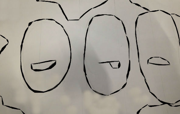
For this action project, we installed the mural my group members and I proposed in Unit 2. In Unit 2, we experimented with different media and artistic techniques. We created a series of 5 swatches which allowed us to visualize our mural through a variety of media and artistic techniques. Our final mural is a tribute mural to GCE’s student body. The mural is a collage of faces made from GCE students’ facial features. Each facial feature highlights individuality and the collective faces represents us communally.

The techniques and materials our group previously chose to be most effective to carrying out the final mural were mosaic and wheat-pasting. We felt that the mosaic added texture and eccentricity, and wheat-pasting helped create a realistic collage image. After much deliberation, my team and I decided to proceed to bring the mural to life through stencilling, wheat-pasting, and block-printing.

Stenciling is an artistic technique which produces an image by applying pigment to a flat surface over an object with designs in it which creates the image. Stenciling allows the pigments to reach certain parts of the surface. A stencil is the resulting image and the object used. Stenciling is cost effective, it can be reused to rapidly reproduce the same design or image, it gives the piece a simplistic look, and allows the addition of details. This technique enhances our mural by making it simplistic and sleek. The mural consists of 5 walls. Three of those walls have white, red, black and gold spray-painted lotus flowers. We were inspired by Shepard Fairey’s signature lotus designs and artistic techniques. Frank Shepard Fairey is an American contemporary street artist, activist, and graphic designers. The other two walls have a checkered pattern of white and grey wallpaper block-print.
Block-printing is one of the oldest printmaking techniques. Block-printing is essentially using a carved material covered in ink to transfer an image on to a surface. It can be done with rubber, wood and linoleum. We chose to use linoleum. We printed out our wallpaper-looking design, traced it into the linoleum, then carved the design. We carved away the parts that we didn't want to print, as the ink will be applied to the raised surfaces to print the design.

We coated the walls silver grey. Our color scheme was grey, white, black, red, orange, and gold. We wanted neutral color with pops of color and coolness hence gold. After applying the wall background to our mural, we wheat-pasted our collaged faces. Wheat-pasting is a liquid adhesive made from flour and water. It is used for arts and crafts. Our mural transforms the space into an arena. It gives the space a sense of activity.

I enjoyed my experience working on the mural. I struggled with compromising with my team mates and being under time constraints. I was the documenter, artistic director, director of operation, and mule in addition to helping my team prep for the mural. I recorded every milestone achieved by my team and made sure that my group members had all the materials needed. I also took part in the decision making processes. My favorite role was documenting. I enjoyed recording our progress which allowed me to take pride in our hard work. I have a good camera which allowed me to take clear pictures. My least favorite role was being the artist director. I didn't feel comfortable making some of the executive decision I made. I unable to visualize concepts and as an artistic director you need such a skill. I wish we had more time to work on the mural. Due to last minutes changes the mural does not look as our group had envisioned, it is much more than we had envisioned. It's so RAW!

Monday, December 14, 2015

Swatch - Up


By the end of this term GCE (Global Citizenship Experience) will be relocating to a new community space that has just been built. For my If These Walls Could Talk course, we were assigned to create and finalized a mural in small groups that will be living in the new community space. We experimented with different mediums and artistic techniques. My peers and I created a series of 5 swatches, and individually reflected on our intentions and experience in choosing the material and or technique that we did. The purpose of this action project was to master the manipulation of different media and techniques and create material swatches for a mural, so that we know exactly what it would look like if it were carried out. In this unit, we examined the stories told through murals and how they were represented through the materials used to create them. We focused on murals from the 1920s (Los Tres Grandes), 1960s, and 1980s. The artistic techniques evolved overtime, from frescoes to stenciling and to xerox transfer. I enjoyed creating my stencil and I am looking forward to making our mural in the new community space.


Name: GN
Title: Global collaboration
Date/Year: 12/10/2015
Measurement: Swatch #1 - “4 inches” by “12 inches”.
Swatch #2 - “5.25 inches” by “12 inches”.
Technique/Medium: Stencil, spray paint (aerosol paint), canvas paper, cutting knife, glue, laser ink printed image, and a sharpie.

Our mural is a tribute mural to GCE’s(Global citizenship experience) student body. The mural is a collage of all of my group members’ facial features. Our collective facial features makeup 3 faces, a smiley, silly, and sad face. These faces represent the student body as a collective. Our mural celebrates the student body, but also calls attention to individuals within it. This concept coincides with that of my unit 1 action project. Each facial feature highlights individuality and the collective faces represents us (GCE student body) communally. The faces are encircled by Earth. The Earth represents students striving to become global citizens. The faces secures the space as ours.

We were inspired by two murals we saw, JR’s “Face2Face” project and the Cutup Collective projects. The Cutup collective is a group of artists, whose work mainly revolves around the manipulation of billboard advertisements. JR is a french artist who takes close up portraits of people who are misrepresented in the media. Our Field Experience to Pilsen also inspired us a lot. We were able to see how mosaics could add depth and texture to a piece. During our brainstorming process, we had a plethora of ideas. The reoccurring idea was collaging. Since we wanted to add a level of complexity, we settled on having the background be Earth.

DR. "Sketch" 2015 
Stenciling is an artistic technique which produces an image by applying pigment to a flat surface over an object with designs in it which creates the image. Stenciling allows the pigments to reach certain parts of the surface. A stencil is the resulting image and the object used. Stenciling dates back over 35,000 years ago, hand stencils were made by blowing pigment through bones over a hand held against a wall. Stenciling has many key advantages.

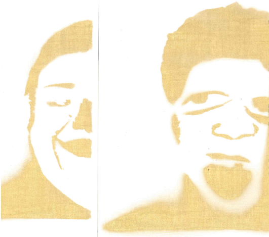
I chose stenciling because it is cost effective, it can be reused to rapidly reproduce the same design or image, it gives the piece a simplistic look, and allows the addition of details. This technique enhances the sketch by making it simplistic and sleek. Creating a stencil is a tedious process. We used Pixlr, a software program that adjusts the contrast and brightness of the final collaged images so that we had defined dark and light areas. We printed the image, pasted it onto a cardboard paper, and clearly outlined the areas of the image that will be cut out for the stencil. Then, I cut out the areas of the image where I wanted paint to appear, attached the stencil to canvas paper, applied the spray paint, and removed the stencil and inspected my work.

The final look had sleek lines and looked simplistic, which was what I intended. Unfortunately, we would not be using this technique in our final mural. Majority rules!


GN, "Stencil" 2015

Our final materials and techniques that our group chose to be the most effective to carrying out the final mural were mosaic and wheat-pasting. We felt that the mosaic added texture and eccentricity, and wheat-pasting helped create a realistic collage image.


JV. “Wheat Paste Swatch”. (2015)

The mosaic will consist of miscellaneous tiles and grout to fill in the spaces between the tiles. The mosaic adds depth and makes our piece pop out more. Mosaics are long-lasting and retains color. Wheat-pasting is simple paste mixture made of water and flour and creates a realistic image.


MV, “Happy Face Swatch”. (2015)


Thursday, November 19, 2015

Little Indi-Paki


For my If these walls could talk course, we were assigned to choose a neighborhood in Chicago, examined its history and the needs of its community, illustrate an image that forfilled those needs, and write an artist statement to defend our design. If these walls could talk is an art and history elective course that explores the history of murals. I chose the 50th ward, also known as West Ridge but focused on "Little India" for this project. The purpose of this action project was to illustrate an image that could be used to create a large-scale mural. I learned about the evolution of the techniques used to show perspective. I enjoyed learning about the Medici family and their influence in the Renaissance in Florence, Italy. I struggled with writing my artist statement, but meeting with my teacher helped clear the haze.

Below is my image and my artist statement!

GN, In Harmony 2015 


GN
11/2015
In Harmony 11” x 14”
Pencil on paper

For as long as I could remember I have been infatuated with India. My obsession is not just related to the Bollywood industry, the rich and spicy food, or the colorful ornate clothing. Although, I should mention that my closet is better suited to Punjab than Chicago and that I hanker over Barun Sobti rather than Zac Efron.

Little India is a ten-block stretch on Devon Avenue on Chicago’s north side. Little India is one of the most vibrant neighborhoods in Chicago. The culture, markets, and savor of this ten-block stretch on Devon Avenue help keep my addiction at arm’s length until I have an opportunity to disembark at Pathankot Airport. Being hit by a heady aroma of spices from a nearby restaurant or being drawn by a saris to a storefront are what keep attracting me to Little India. Skipping to Devon is a lot easier than trudging to Mumbai or Punjab. Devon is the most diverse street in the city. Although mainly Indian-focused, according to the Executive Director of West Ridge Chamber of Commerce, 75% of the area’s residential population is Jewish. Devon is home to Indian-Americans, Pakistani-Americans, Jews, Eastern-Europeans, and Assyrian-Americans and this melting pot gets along just great.

I’m proposing a mural that celebrates Little India, but also one that calls attention to the individual cultures within it. Although Little India is mainly focused on India, a lot of businesses are also owned by Pakistanis, Russians, Iraqis among others. My piece is both a tribute mural to make Little India even more beautiful and to bring to attention the plethora of cultures residing in Little India especially Pakistan that are often overlooked.

My sketch is of an Indian woman and a Pakistani man marrying. The motifs in the background are prominent symbols in both cultures. My sketch mimics the complex, more detailed style of Ancient Greeks and Ancient Egyptian paintings. This more complex and detailed style of paintings showcase the relations between Indian and Pakistani in there land of origin. Though Indians and Pakistanis don’t get along in their land of origin, I find it fascinating how they coexist in harmony in Little India. I was inspired by the use color and the simple yet intricate forms in the Ajanta cave Frescoes in India. I utilized the Hindi and Urdu both the official languages in each country to represent each culture’s individualism while also accentuating their cohesion and harmony. With the motifs receding in the background and telling its own story, I’ve utilized the use of vignettes to create meaning, fluidity, cohesion and uniformity in the painting. In order to represent the vibrancy of each culture, I used such colors as red, blue, yellow, pink, orange, and brown.

When installed, the mural will span the wall in the center of Little India and Pakistan. I hope that this mural transcends its audience to a state of joy, uniformity. and inclusion.